Thursday, March 3, 2011

Glowing Window Treatment


 I am drawn to colored glass and pick up any I see at thrift stores and garage sales. Mostly my collection consist of green glass. Anyone seen Return to Oz?

My collection also usually rests in a box gathering dust. I came across said box and thought about how I've went with green hues in my kitchen. Perfect opportunity. A little love for St. Patrick's Day too!

After a good bath, the glass was ready to display. I also added my green dish soap, a thing that reminded me of a ferris wheel, and Glad Hand (  that's what the antique store called it) to the display. Plus my green egg cup with a real eggshell housing the spider plantlet rooting.


It's difficult to get decent shots- for me anyway! As the sun sets, the whole kitchen is bathed in a cheery green light. It's such a bright spot in a dimly lit kitchen.


The cast offs


post signature

Visit thecsiproject.com

Tuesday, March 1, 2011

Kid's Art Display


Since I have made Family HQ there is not anywhere, but the fridge to display the 100 pieces of art that come home from school each week. We have a small wall in the kitchen that wasn't getting much love- the perfect place for a larger scale display! I saw a clipboard art display idea at Lansdowne Life.

Poor wall
I bought 6 acrylic frames at Dollar General for $2.50 each. I could of waited to thrift regular clipboards for much less, but I was eager to get it done. As you will see acrylic frames caused some issues- thrift or buy the particle board ones to make it easier on yourself.

Clear, smoky and blue acrylic frames

Up until this point, I haven't done any decorating in the kitchen. I needed to settle on a basic color scheme. It has proved difficult because the entry, living room, hall, and the kitchen are all open to one another. For the living room area, I had relied on a craigslist dot "wall thingy." The living room is blue hues and accented with more colors from the "wall thingy." Yes, I'm going to keep calling it that. So, I pulled it out and went to matching up scrapbook paper. I've settled on green hues for the kitchen.

I did some measuring and cut a template. The 12X12 scrapbook paper wasn't big enough so it left a gap at the top. Since I bought all the clipboards in different colors, it didn't look cohesive. I took the scraps of paper and made little coordinating toppers for each clipboard. Much better!


I applied mod podge and it made a big wrinkly mess! As I tried to smooth it, I tore the paper and had to redo 3. I had emailed Erin at Lansdowne Life asking to link and told her my issues. She suggested going easy with the mod podge and drying throughly between applications. It worked! There were still some wrinkles, but I left them alone (as she also suggested) and they were not so bad after it dried. I blame the acrylic clipboards!

To finish the edges, I flipped them over and used a razor to cut off the excess. It gave them a nice finished look!

Holds extra large art well too!
post signatureVisit thecsiproject.com
Party Button

Saturday, February 26, 2011

Family HQ


Family HQ is done and ready to function!! Every portion of the bulletin board has an integral purpose to running the household efficiently. NO PAPER CLUTTER ALLOWED! Topped with coordinating happiness and a few ingenious ideas, I L-O-V-E it!

Let's look how it started for drama:


    You can see how I recovered the bulletin board here.

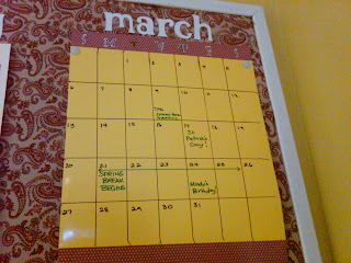
Calendar


The calendar is a shiny piece of scrapbook paper drawn with Expo Vis a Vis wet erase markers. These are excellent markers! No smearing! 

Day by Day


Day by day is basically daily and weekly routines to help fine tune our schedule. These are currently handwritten because they may need tweaked as we go along, oh, and I'm out of printer ink...

Morning
  • Make bed
  • Brush teeth & hair
  • Get dressed 
  • EAT
After School
  • Snack time
  • Homework
  • Finish responsibilities
Bedtime
  • Lay out clothes
  • Bath time
  • Brush teeth
  • Tuck In
Sunday
  •  Plan week
Monday
  • Focus on goals
Tuesday
  • Clean day
Wednesday
  • Prepare to shop
  • Clean van
Thursday
  • Errands
  • Groceries
Friday
  • Business
Saturday
  • Family Day!!

Chore Chart

I have changed the headers of both charts to match the rest of the board. You can read about the system here.


Focus & List


Focus and List were created from the same shiny scrapbook paper and Vis a Vis markers. Focus is what we currently are working on. List is, well, a grocery list. They both can be updated as needed with a little baby wipe action!

Polish


Polish is my word for 2011.It's up for a reminder to stay on track! You can read about what it means to me here.


Headers on the board is all Cricut Alphalious cut roly poly shadow at 2 inches. Family HQ is cut regular at 6 inches. The swirls around polish is from Home Decor cartridge- it's a frame cut at 11 inches cut up to fit.


Thanks for reading!
Nicole


Visit thecsiproject.com

Wednesday, February 23, 2011

Chore Chart


This is the second installment of the making of Family HQ! The first step was redoing the bulletin board. Keeping to my goals, the chore chart is essential to teaching them responsibility and lightening the load on me. We have done many chore charts in the past, but I've found they only do the chores when they want and for money! 


I came across Coupon Cookin’s genius approach to chores. She gives the children responsibilities to complete before extra chores can be earned for allowance. For more tips and a free chore chart printable visit Coupon Cookin!

To get started, I wrote a list of responsibilities I felt the kiddos should complete without compensation.

  • Make bed
  • Feed dog
  • Put away toys
  • Set/ clear table
  • Put away clean clothes (this will be a life saver for me)

Next, I made another list of chores that I would be willing to compensate for- AFTER MY RESPONSIBILITIES ARE COMPLETED.

  • Vacuum
  • Empty bathroom trashes
  • Outside trash pick up
  • Wipe sinks
  • Dust
  • Windows

As for compensation, each chore will be worth a quarter, 15 minutes of video game, 15 minutes of computer time, or 15 minutes of T.V. I painted wooden shapes to be the Media Tokens to give to the kids. I opted not to label them for flexibility.

The actual chore chart is 2 charts- one for responsibilities and one for chores. Each chart has the written words and a picture for each responsibility and chore.

On the written side, my 7 year old (K)will check off her duties and the picture side is for my 5 year old(R). My kids seem to like using stickers to signify they did the job. To accommodate daily stickers, I attached strips of paper streamers. Each day a fresh streamer can go up!

Of course, I chose the Cricut to style this project. Each individual letter placement was reminiscent of the Heart Typography project. Like the heart project, my muffin tin method came in handy. And look from my craft and stash stealth mode, I have dried letters and glue still in it. It POPPED right out! Wahoo! Too bad it’s not that easy with paintbrushes with dried glue…
Old glue popped right out!
The Set up
laying it all out

Mod Podged as I did each letter
Using the other end of the paintbrush to position


Here’s the rundown with the Cricut

  • Cricut Lite Chore Chart for the pictures cut at 2 inches
  • Alphalicious- cut at 1 inch for lettering. Braces cut at 2.25 inches. (Might too big)
  • For the chart headers, letters cut 1.75 inches with the ‘O’ and ‘P’ cut to 1.25 inches to save room on RESPONSIBILITIES.
  • Home Décor- label layer cut at 6 inches each to frame out headers.

After I got everything in place, I noticed the headers were washed out against the yellow scrapbook paper. I should have used the shadow feature in the maroon polka dotted paper-BUT it was all glued and I was running out of paper. I just took a marker and traced around the header letters for definition. It’s not perfect…

I really had to let go of perfectionism and just get this done. If I hadn’t let letters be a little wonky and outlines a little uneven THIS WOULD NOT OF GOT DONE AT ALL! The chart is supposed to help everyone and not become a problem itself.

Hooray for character!

Some details shots:


Update! I've changed the headers to match the rest of Family HQ


post signature